
The colour trends set to take over our homes in 2020
- By Peter Gordon
- •
- 30 Sep, 2019
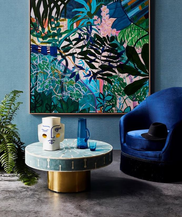
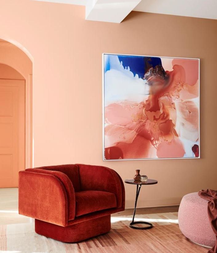
MUTED BRIGHTS
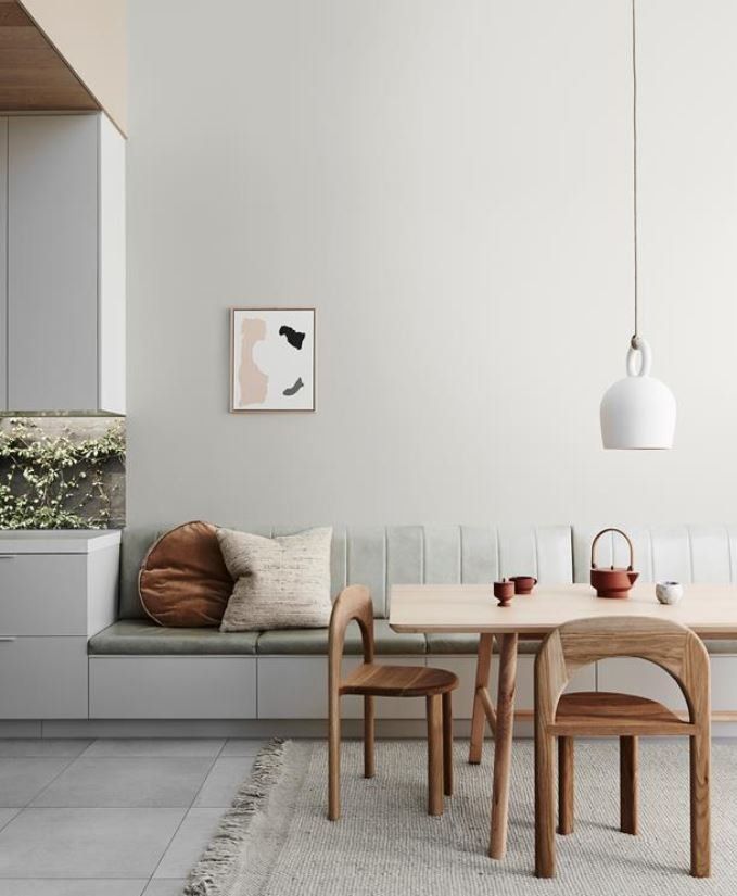
NEUTRALS AND EARTHY TONES
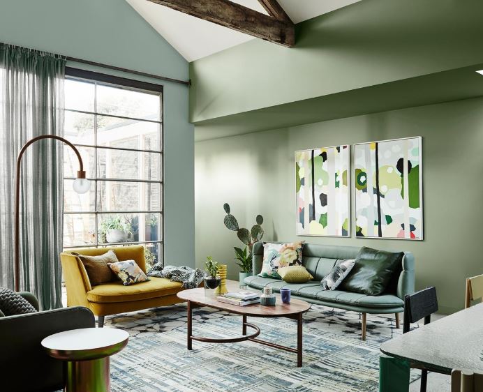
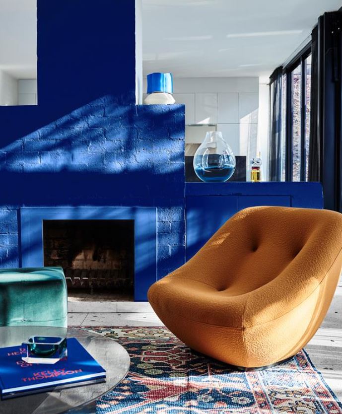
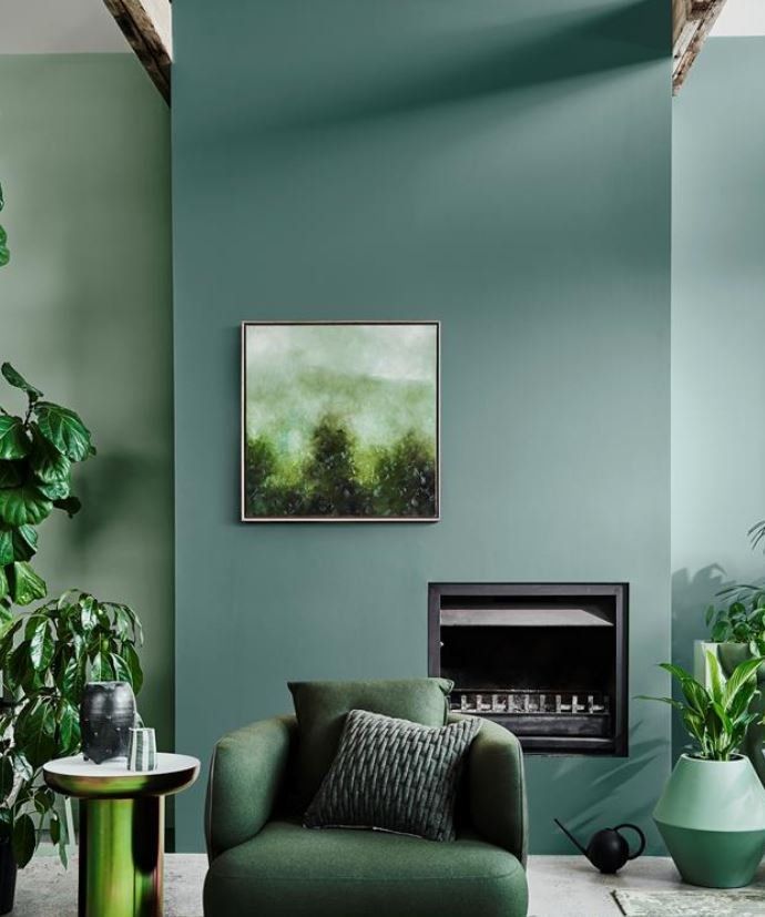
BLUE AND GREEN SHOULD DEFINITELY BE SEEN
GREEN IS THE WORD
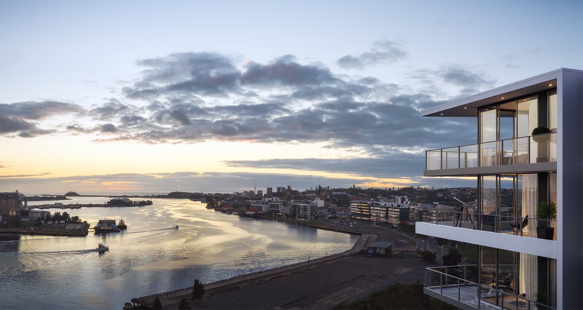
| Quiet simply, the Palms is the place to buy! |
Sydneysiders and Melburnians, put aside your equally outstanding flat whites for a moment. Stop bickering about whether great beaches beat cool laneways (they do) and desist from debating whether all baristas require waxed moustaches (ideally).
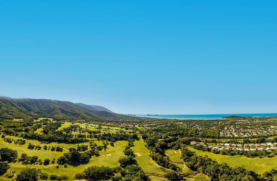
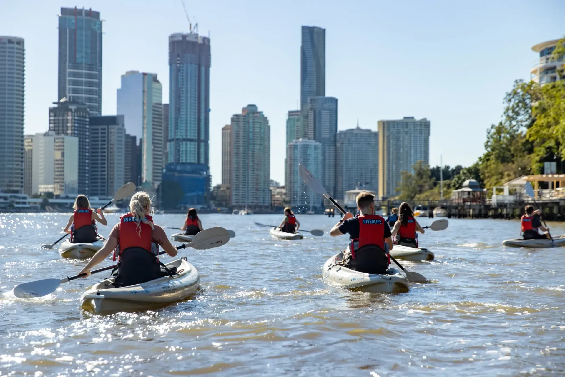
Because Brisbane is closing in on the title of Australia’s best city, and we must join forces to keep this subtropical upstart in its place.
Time magazine recently named Brisvegas on its “World’s Greatest Places” list, and omitted our cities. It’s a huge shock (and who knew they still published Time magazine?). But they might be onto something.
Time points to the 2032 Olympic and Paralympic Games, which will be hosted in the maroon metropolis. Brisbane will do a fine job, even though it’ll baffle the world when rugby league is added to the schedule and Queensland is allowed to field its own team.
Time’s most radical claim is that Brisbane is worth visiting now, but tourism is surging. Not only did Lin-Manuel Miranda recently drop in to catch Hamilton , but hundreds of Hamilfans flew up to watch his interview with Leigh Sales (presumably unaware that it would subsequently arrive on iView for free).
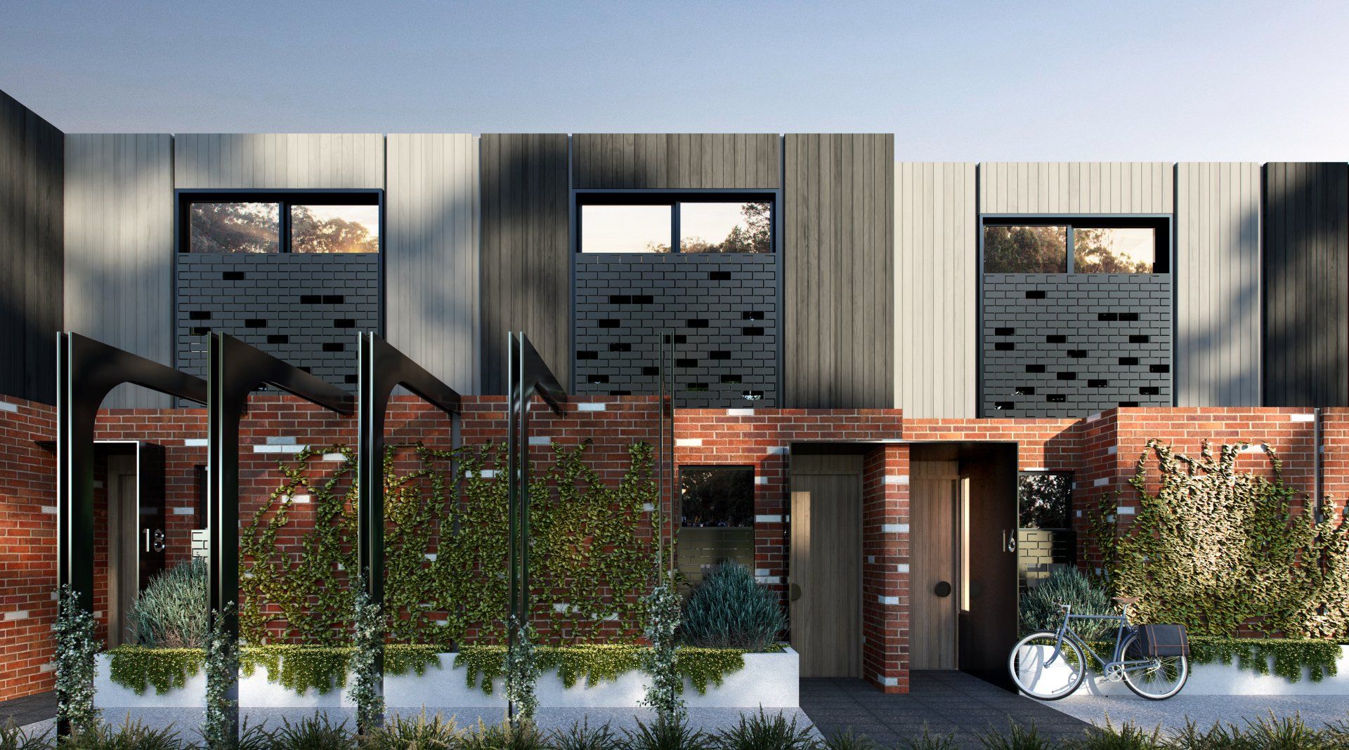
A leading local agent has appraised each side of these duplex's to be worth $665k on completion and rent for $495 per week. So that is massive potentail instant equity of up to $390K on completion, which is incredibly hard to find.